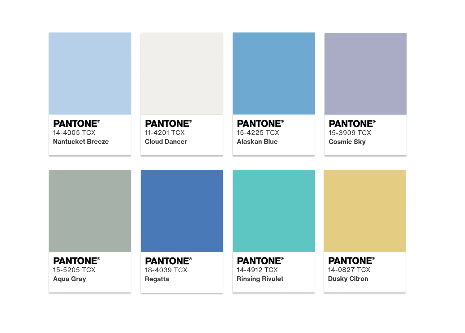
The last month of the year is also always filled with talk about the "color of the year". While all paint companies went to darker, nature inspired colors, Pantone
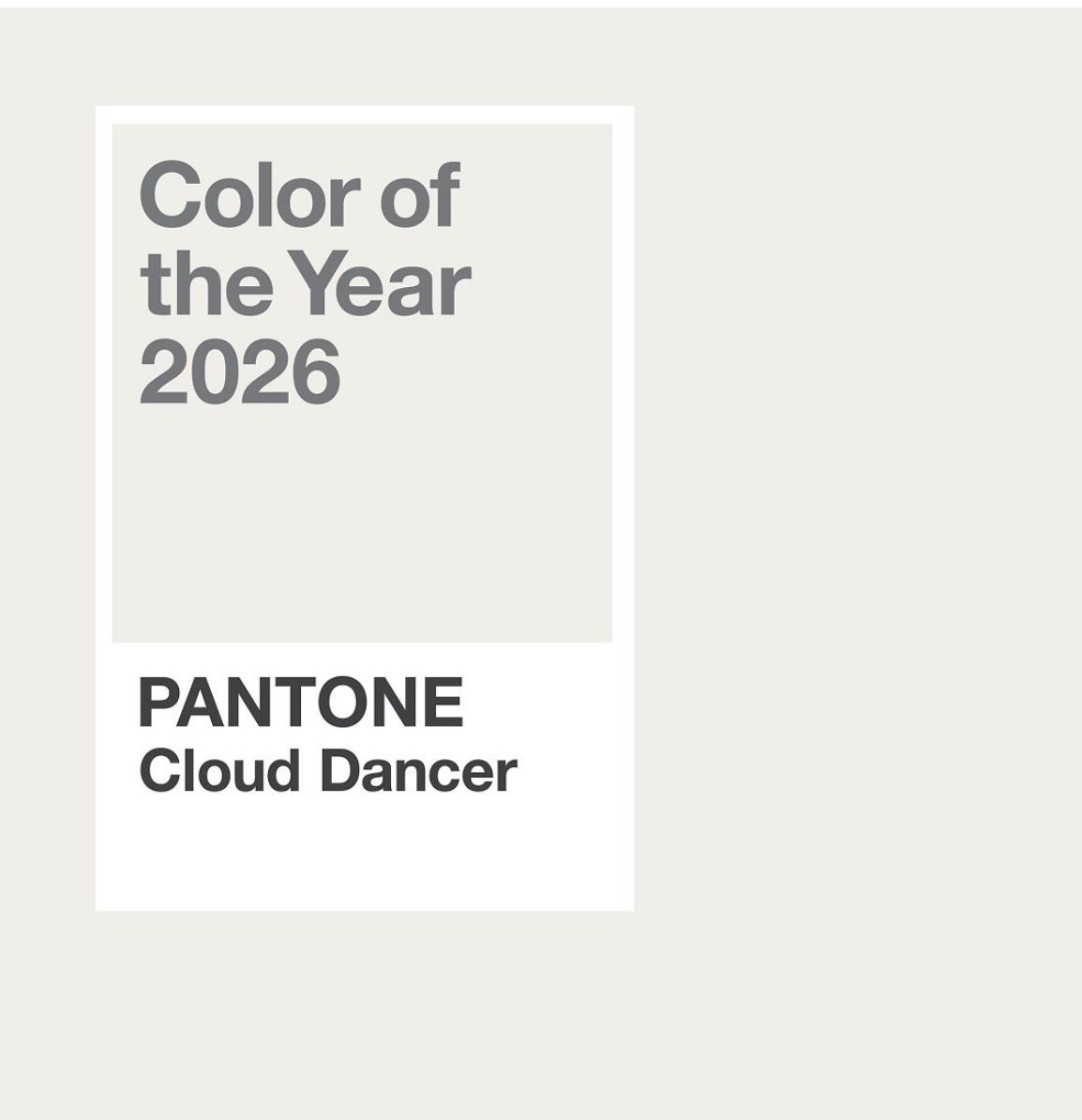
chose "Cloud dancer" as the color for 2026. Cloud Dancer is a white fabric with gray and beige undertones. Or as someone said: it is the color of every builder and collage dorm.
Respectfully, like many, I am not thrilled with this choice. It totally doesn't follow the trends in interior design and fashion. Sure, there is some white as an accent color, but white is not back and certainly not as a main player. This color is too light! It would be rather strange to even think this because we just left white behind us. Not many will go back to what was up to 2022! Also, last year Pantone had chosen chocolate mousse as the color of the year. Trends don't make those abrupt switches.... they go slowly. From that dark brown, which was an excellent choice, to off white is just too much of a swing and unrealistic. Benjamin Moore has selected a very dark brown, Silhouette, as its color of the year. They can't be both right.
Many times, Pantone had a "wrong" choice or maybe I should say, we read it wrongly. It is not so much about the color itself as well as the message that the choice of color sends. Here too, Pantone missed the boat. This off white is not a clean new canvas. Wallpaper is back, maximalism is the trend, we are hungry for color, cool and cold is not what we are looking for.
Pantone states we need some organising in our life? Are we too busy with non-essential things? Do we need more calmness and a break from digital overload? Is that how we should read this color choice? How would Cloud Dancer provide this? I don't know either. It seems to me they didn't want to make a choice. It is a neutral. It is a neutral that can go with anything. Is anything the trend? No. The only positive message of Cloud Dancer is that we can't do things by ourselves. We need company. Cloud Dancer is screaming for other colors. It is a lonely color. It needs company, help.
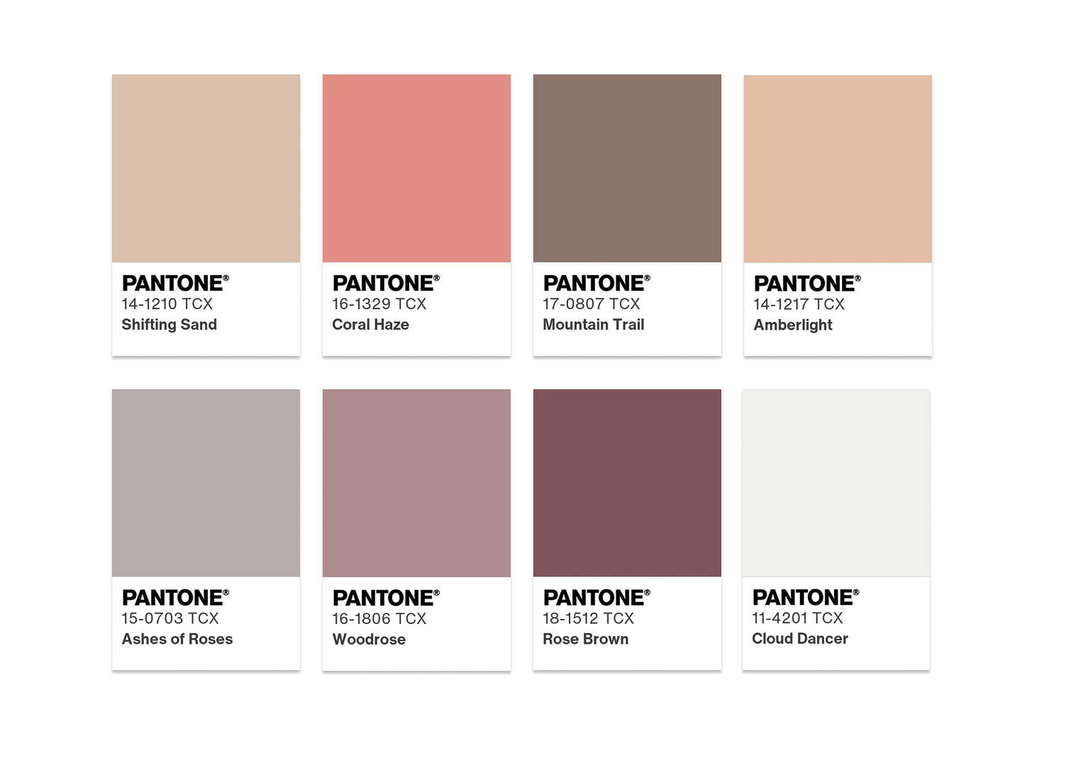
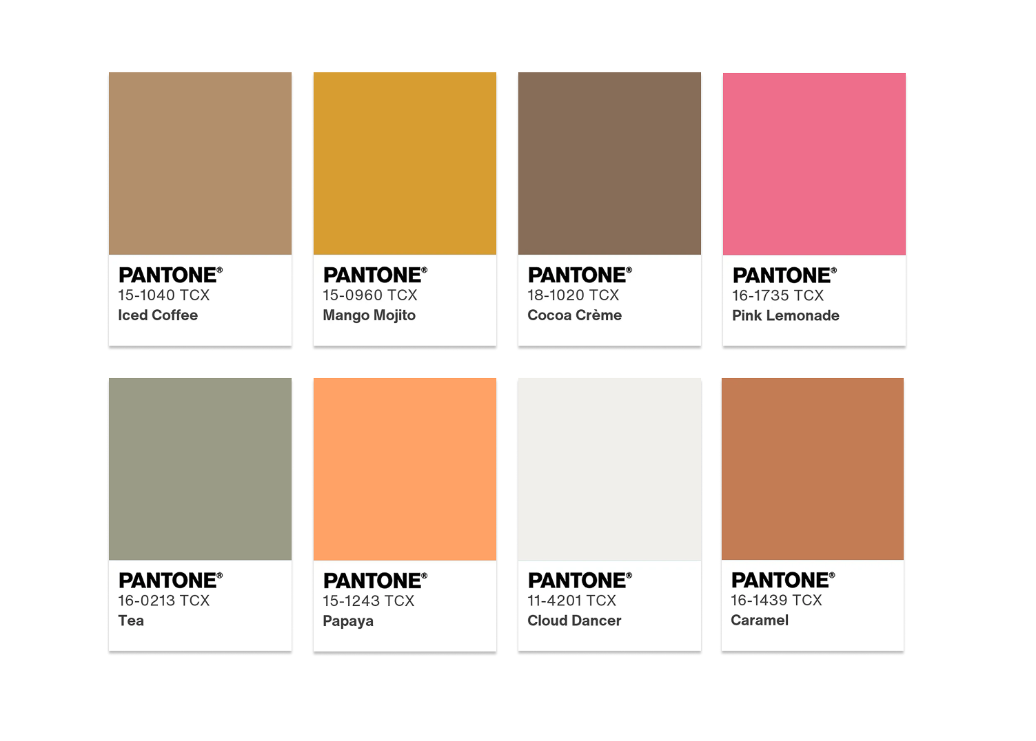
Now the palettes that Pantone chose to go with Cloud Dancer are much, much better. On its website you can find some trendy color combinations that include Could Dancer, but just as a side color.
In all, I would disregard the choice and go with any or all the colors of every other company working with color has chosen for our inspiration and let Pantone dance by itself on its cloud that is so far away from most of us to be relevant.
Hope you can look back on 2025 with gratitude in your heart and optimism for 2026!

