Halcyon tonals
This blog will be about a fabric collection that I consider to be one of the best new collections. It is Halcyon Tonals by Jason Yenter of In the Beginning Fabrics. I had the pleasure of talking with Jason about this grouping and get a little bit more background. He and I worked together at Market for many years, when I was still buying for my own fabric business. I emailed him to see if we could set up a phone call and talk about it and he agreed. I'm looking forward meeting him again at Market soon!
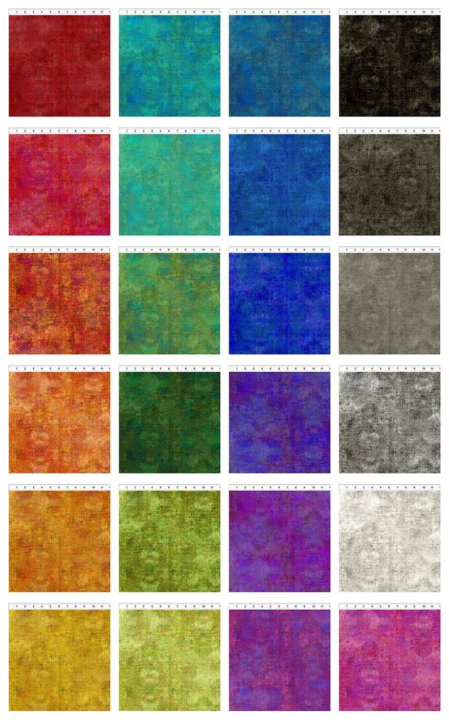
The Halcyon Tonals collection is a collection that grew out of another collection, named Halcyon. As is so often the case, blenders were needed to support the busy prints of the Halcyon Collection that came out in July of 2022. The inspiration to make the tonals came from those busy prints, which made up about 75% of the collection. When Jason started to sew with his designs, he needed something to connect the prints and a much less busy fabric was needed. Designers have the exact same problems with their projects as we all do. The first 8 colors were developed for Halcyon and the colors were determined by that collection. Then the response from sales reps and shops was that they needed more colors. "I listen to my customers", says Jason. This demand is resulting in 16 additional colors that will come out in December, bringing the total to 24 Halcyon Tonals. They are now a separate group of blending basics and will be available for a longer time. 16 new colors within a time frame of 6 months is unheard fast in the fabric industry. That by itself says something:"Jason, you have a winner here"!
The colors of Halcyon Tonals are very much Jason's signature colors. It is his preferred palette. He makes many fabrics in many different colors for his company In The Beginning Fabrics, but when the fabric is getting labeled with his personal name, most of the time it is this mid range of colors. Jason's personal preference is leaning more towards blacks than to browns, which explains why this collection has 5 strong neutrals in the black family. From chalk to charcoal. Color wise, it's a timeless collection, far away from any trend in color. It's Jason's core as he has designed and shown in many other collections like the beautiful (and still going strong)
Dit Dot Evolution and
Prism (coming out in 2023). The Halcyon Tonals are very much similar to the Dit Dot Evolution, a collection that I considered to be one of the best of Market a few years ago (2017 or 2018, if I remember correctly). Even more, when you take a look at the
video Jason posted for Dit Dot Evolution at that time, you can see the familiarity with the Halcyon Tonals so clearly. I could recognize this palette from a distance as Jason's. There is no desire to follow any trend here. It's about a designer who knows his strength and who loves color, in capital letters. I applaud him for this.
Talking to Jason, he emphasizes that much of the character of the fabric is made possible by the digital printing technique. About 99% of all the In The Beginning Fabrics are now top of the art digitally printed. Where screen printing can have a maximum of about 18 colors, digital printing opens up the possibility to hundreds of colors, all in one piece of fabric. The result? The fabric has a tremendous depth. It is so rich, so drenched with color.
He also used a large repeat for his print. The Halcyon Tonals have a repeat of 22" x 16", which is very large for a blender. Usually the repeat is much, much smaller. This means that using the same fabric on multiple places in a quilt, will still result in extra interest. There is a visual movement in this line, it is not the same everywhere, but still connected.
I asked Jason if he thinks it looks like Grunge. I noticed online that some shops were advertising the Halcyon tonals as Grunge-like fabric. Personally, I don't think it looks like Grunge at all (except that it is also a blender with texture), but it was interesting to me what Jason would say about this. Many companies are trying to create their own version of Moda Grunge, getting a piece of the cake that this fabulous Moda collection has created. Can't blame them, it is business after all. Most companies are not as successful as Moda Grunge and their imitation lacks the same character. They are not the best of the best. Ofcourse, Moda is "smiling" when they see all these imitations popping up: it's the best compliment for one of the best, if not the best collections of our time.
Jason's response: "Maybe the greys and black look like Grunge?" I think he was referring to the rock style Grunge that emerged in his hometown of Seattle WA? He was not thinking of Moda Grunge at all and I had to explain to him why I had asked the question. Clearly, he was not trying in any way to come up with his own version of Grunge. He doesn't need to nor does he want to.... He knows his place. He was trying to pick up the character that was in the original Halcyon Collection and what we are seeing with the Halcyon Tonals is this trend of slightly distressed and detailed textures everywhere in home decor, especially also in wall paper (grass cloth, see a previous blog). Grunge and Halcyon Tonals both fit in the same trend, but are very different!
The Halcyon Tonals are taking an existing trend to another level because of their digital printing and their scale. Jason is working on Halcyon 2 and that collection may come out in August 2023. It will use the Halcyon Tonals as coordinates, but I wouldn't be surprised if we see the Tonals getting an expansion before then. They are just too good, something, I'm convinced, Jason will likely hear from shops and customers. Can't wait to get my hands on mine in December!